There’s a certain level of excitement when we get to design vehicle graphics for clients. I mean, who doesn’t love to see their work THAT BIG!?! But every time we’re asked to scale graphics to these extremes, we stop and consider the BIG 3 challenges of BIG DESIGN.
-
Design for resolution
-
Design for movement
-
Design for brand consistency
So, when Capital City Fruit out of Norwalk, Iowa brought their latest delivery van concept to us for a brand wrap, before we even opened the vehicle CAD schematics and our design software, we started thinking. What could trip us up on this vehicle wrap design?
Designing for Large Format Reproduction: Quality In = Quality Out
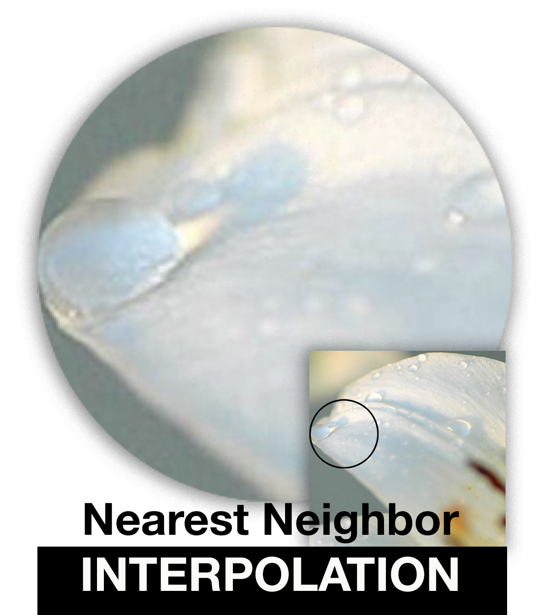
Interpolation. Click to view larger in your browser.
Like trade show graphics, outdoor graphics (billboards) and vehicle graphics have the added design challenge of maintaining resolution integrity. For graphic designers who live in Adobe Photoshop, Illustrator and InDesign, resolutions of 266 to 300 DPI (dots per inch) are the standard for offset printing. At that resolution, printers can reproduce the finest of highlight and shadow areas and hold subtle value changes with beautiful results. But when you’re scaling images from 8″ or 10″ to fit areas 40″, 100″, 150″ inches or more, the ability to hold detail resolution becomes a BIG challenge. What looks good on your Website or in a brochure will definitely need some resolution review to get it on a vehicle or larger.
Large format printers have advanced spectacularly with resolution tolerances. Some have the capability to hold beautiful values and tones at resolutions as low as 96 to 100 DPI. But after that, no matter the level of your Photoshop skills, to scale above the raw file size, you’ll need some serious conjuring skills.
Sure, there are some scaling apps and software out there that tout the ability to scale low resolution images while keeping fine detail and smooth integrity, but let’s face it, you just can’t push pixels into a space where there is none. The result: INTERPOLATION (There are many kinds of interpolation, but “Nearest Neighbor” is the most common and most annoying for designers. Click here for a deeper definition/explanation of interpolation with scaling. ).
For best results you have to pay attention to the final resolution of the printer. In the case of the Capital City Fruit vehicle wrap, we knew we had a final resolution of 100 DPI. So the raster images we shot and used for the sides of the van needed to be at a minimum, 100 pixels per inch when scaled to 100%.
Designing for Movement: Keep It Simple, Stupid (the K.I.S.S. Theory)
While the previous challenge fell squarely on the technical side, the next one always leans more toward the “conceptual” side. When designing for vehicle wraps or even just basic vehicle graphics, you have to ask yourself, “Can the design and the message be understood at 70 miles per hour?”

DON’T DO THIS!
Think about it. We’ve all seen those vehicles – the ones with a dozen or more bumper stickers flashed across the back side. What’s your first reaction? If you’re anything like me, you get really close up to the vehicle, flying down the highway at 70 miles per hour or faster to see if you can read ’em all! GAAAAH! Not really. NO TAILGATING!
What happens is: the hodgepodge of messages and graphics turn into a blur of confusion and nonsense. We call this “NASCAR-ing up your design.” Sure, in a parking lot or at a stop light you might be able to catch a few of the messages, but is that really the goal of your design – to be partially understood?
Keep it Simple, Stupid. The K.I.S.S. theory of communication comes in handy when designing for movement. If you can’t comprehend the design or understand the messaging, what good is the wrap in the first place?
With the Capital City Fruit delivery vehicle, we knew keeping the design simple would make communicating their message easier. We made sure to incorporate a clear call-to-action with memorable graphics and we kept the “technical” information at a minimum (website on the door). Ultimately, we wanted to say, YOU WANT FRESH PRODUCE? CHECK US OUT!
Designing for Brand Consistency: Build on Your Brand’s Strength

Click to view larger in your browser.
One thing that will confuse your consumers and degrade your design impact is inconsistency. A TRUE Brand maintains Truth, Relevance, Uniqueness, and Engagement from beginning to end. That means from the business card to the Web site to the delivery vehicles and more, it’s imperative to maintain a consistent design, a consistent position, a consistent message to ultimately build a loyal and CONSISTENT brand community.
While we’ve had the opportunity to work with Capital City Fruit on a number of campaigns, it’s the base branding and packaging elements we’re fond of. Together, we’d recently worked through some fun shipping and packaging carton designs and logic told us that a similar theme would not only lend brand consistency to their delivery vehicles (I mean WHAT EXACTLY were they delivering, amiright?), but also help them stand out in a fast moving industry. (Pun intended.) By taking the type styles and twisting a variation on the tag lines used on previous campaigns, we were able to to cleanly and effectively build on the brand messaging they’d started with the cartons.

Click to view larger in your browser.
All-in-all, with smart design and strategic execution the delivery vehicle graphics have become a seamless element in a strong brand for the client.
For over a decade, SPOKE Communications has provided our clients with the best in strategic marketing communications including graphic design of all kinds. If you have questions, would like to discuss your graphics needs or work with us on marketing strategies for your company, please don’t hesitate to give us a call at 515-257-6584 or send me an email directly at andrew@spokecom.com.
Until next time,
KEEP COOKING!
Andrew B. Clark
The Brand Chef