Wait, what? Seafood from the Midwest?
Ope, precisely!
From Osceola, Iowa, just a short jaunt south on I-35 from the Des Moines metro, you’ll find one of the Midwest’s premier packaged seafood providers. For the past two and a half years, the father/son team at Mayhew’s Market have been taking the Midwest seafood world by storm, offering the highest-quality shrimp and fish caught fresh out of the Atlantic and Alaska’s Bristol Bay.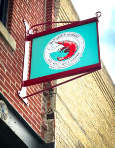
Recently, SPOKE Communications worked with the Mayhews on updating and developing new brand packaging and display graphics for the upcoming market season.
The Challenge:
National food retailers and chain grocery stores have been in the market of reselling packaged seafood for years. That being said, a small seafood distributor out of rural Iowa needed to stand out amongst bigger retailers with bigger budgets. With limited resources and similarly limited budgets, the Mayhews struggled to create a strong market presence with attractive, on-brand packaging. Past packaging design efforts resulted in a “DIY” look that didn’t suit a highly discerning customer base or the aspirations for the brand.
From the client:
“We need to build a brand that visually communicates ‘The Shrimple Life’ (with a wink), the relaxed and easy-feeling lifestyle that comes from the sea. Like the feeling you get at a shrimp boil on the beach with a few of your closest friends, {Mayhew’s} needs to connect to the consumers visually while making them feel relaxed, and happy.”
The Solution:
Develop a visually engaging brand packaging solution that communicates the “Feel” consumers expect from a quality (Nationally competitive) seafood distributor, while keeping production costs to a minimum.
The Execution:
Without taking the client through a full rebranding and compiling costs on top of production, SPOKE worked with the Mayhews to develop a brand packaging design that 1) complimented their existing brand identity while 2) offering a visual tie to the brand culture they expressed from the outset.
From SPOKE:
“When someone comes to us with design ideas that start from an emotional perspective, the gears really get turning. There’s always a personal connection with input like that and we want to do what’s best visually and economically for our clients.”
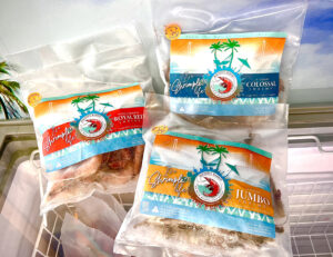
The designs SPOKE provided were centered around a master templated brand packaging program that incorporated the Mayhew’s original identity with stylistic representations of “The Shrimple Life.”
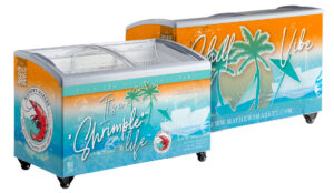
*Product display cases – mock-up only
The base designs are intended to provide a relaxed vibe across all of the Mayhew’s products. With the incorporation of a bright color palate communicating a relaxed, “Salt in the air and sun on your face” coastal feel, the base design can then be augmented from package to package, clearly identifying the variety of each premier product. As a bonus, the designs can also extended to include their display cases and shop interiors, creating a fully encompassing brand identity and feel for their customers.
So, do our designs say “The Shrimple Life”? The Mayhews certainly think so. With new packaging done and new display freezers in production, the first market appearance will be in a little over a week. We’ll be on hand with the Mayhews to see how the audience reacts.
If you have a design challenge and are looking to build a visually stimulating brand that connects to your audience, please reach out to SPOKE Communications for a consult. With more than two decades of brand development and graphic design experience, SPOKE can help make that connection while keeping production costs and design investments low.
Food for thought (literally?)… 😉
Until Next Time
Keep Cooking!
Andrew B. Clark
TheBrandChef
SPOKE Communications, LLC